

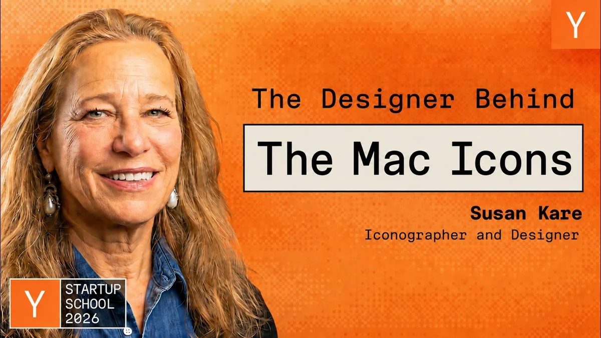
Susan Kare on Designing Iconic Mac Icons

Macintosh designer Susan Kare shares insights on creating iconic interfaces, from the 'Happy Mac' to the Chicago font, and the design philosophy behind them.

8 min read
Susan Kare speaking on stage about Mac design
YC

Visual TL;DR. Susan Kare's background led to Macintosh opportunity. Macintosh opportunity required Designing for Humans. Designing for Humans resulted in Iconic Creations. Iconic Creations based on Design Philosophy. Iconic Creations created Defining User Interfaces. Defining User Interfaces with Unintended Consequences.

  1. Susan Kare's background: sculptor of life-size razorback hogs, feeling isolated, desired team-based work
  2. Macintosh opportunity: high school friend Andy Hertzfeld offered interview for designing symbols and typefaces
  3. Designing for Humans: creating visual elements that would define user interfaces for decades to come
  4. Iconic Creations: designed 'Happy Mac' icon and Chicago font, defining early Mac user experience
  5. Design Philosophy: insights on creating iconic interfaces and the design philosophy behind them
  6. Defining User Interfaces: her work became foundational, shaping how users interact with personal computers
  7. Unintended Consequences: her designs influenced generations of digital interfaces beyond the original Mac
Visual TL;DR
Visual TL;DR, startuphub.ai Macintosh opportunity required Designing for Humans. Designing for Humans resulted in Iconic Creations. Iconic Creations created Defining User Interfaces required resulted in created Macintosh opportunity Designing for Humans Iconic Creations Defining User Interfaces From startuphub.ai · The publishers behind this format
Visual TL;DR, startuphub.ai Macintosh opportunity required Designing for Humans. Designing for Humans resulted in Iconic Creations. Iconic Creations created Defining User Interfaces required resulted in created Macintoshopportunity Designing forHumans Iconic Creations Defining UserInterfaces From startuphub.ai · The publishers behind this format
Visual TL;DR, startuphub.ai Macintosh opportunity required Designing for Humans. Designing for Humans resulted in Iconic Creations. Iconic Creations created Defining User Interfaces required resulted in created Macintosh opportunity high school friend Andy Hertzfeld offeredinterview for designing symbols andtypefaces Designing for Humans creating visual elements that would defineuser interfaces for decades to come Iconic Creations designed 'Happy Mac' icon and Chicagofont, defining early Mac user experience Defining User Interfaces her work became foundational, shaping howusers interact with personal computers From startuphub.ai · The publishers behind this format
Visual TL;DR, startuphub.ai Macintosh opportunity required Designing for Humans. Designing for Humans resulted in Iconic Creations. Iconic Creations created Defining User Interfaces required resulted in created Macintoshopportunity high school friendAndy Hertzfeldoffered interview… Designing forHumans creating visualelements that woulddefine user… Iconic Creations designed 'HappyMac' icon andChicago font,… Defining UserInterfaces her work becamefoundational,shaping how users… From startuphub.ai · The publishers behind this format
Visual TL;DR, startuphub.ai Susan Kare's background led to Macintosh opportunity. Macintosh opportunity required Designing for Humans. Designing for Humans resulted in Iconic Creations. Iconic Creations based on Design Philosophy. Iconic Creations created Defining User Interfaces. Defining User Interfaces with Unintended Consequences led to required resulted in based on created with Susan Kare's background sculptor of life-size razorback hogs,feeling isolated, desired team-based work Macintosh opportunity high school friend Andy Hertzfeld offeredinterview for designing symbols andtypefaces Designing for Humans creating visual elements that would defineuser interfaces for decades to come Iconic Creations designed 'Happy Mac' icon and Chicagofont, defining early Mac user experience Design Philosophy insights on creating iconic interfaces andthe design philosophy behind them Defining User Interfaces her work became foundational, shaping howusers interact with personal computers Unintended Consequences her designs influenced generations ofdigital interfaces beyond the original Mac From startuphub.ai · The publishers behind this format
Visual TL;DR, startuphub.ai Susan Kare's background led to Macintosh opportunity. Macintosh opportunity required Designing for Humans. Designing for Humans resulted in Iconic Creations. Iconic Creations based on Design Philosophy. Iconic Creations created Defining User Interfaces. Defining User Interfaces with Unintended Consequences led to required resulted in based on created with Susan Kare'sbackground sculptor oflife-size razorbackhogs, feeling… Macintoshopportunity high school friendAndy Hertzfeldoffered interview… Designing forHumans creating visualelements that woulddefine user… Iconic Creations designed 'HappyMac' icon andChicago font,… Design Philosophy insights oncreating iconicinterfaces and the… Defining UserInterfaces her work becamefoundational,shaping how users… UnintendedConsequences her designsinfluencedgenerations of… From startuphub.ai · The publishers behind this format

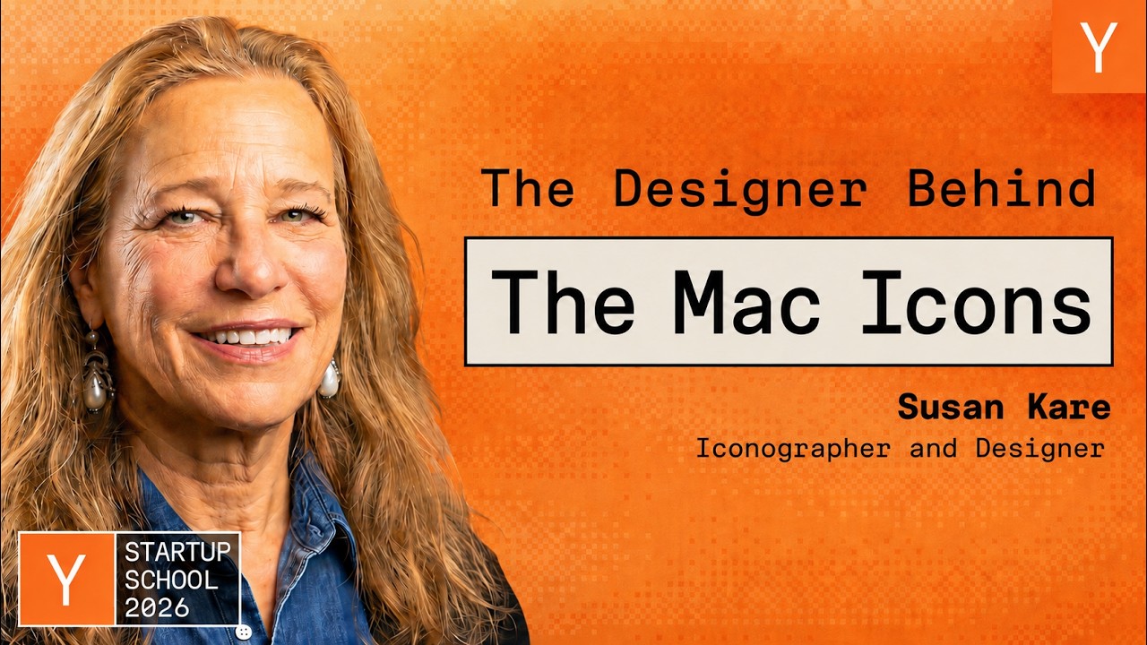
Susan Kare, the iconic designer behind many of the original Apple Macintosh icons and fonts, offered a glimpse into the early days of personal computing design at a recent Startup School event. Sharing her journey from an art major to the "Macintosh artist," Kare recounted the challenges and triumphs of creating visual elements that would define user interfaces for decades to come.

From Sculpture to Silicon Graphics

Kare's path to Apple was unconventional. Before her pivotal work on the Macintosh, she was a sculptor, welding life-size razorback hogs. This experience, while fulfilling artistically, left her feeling isolated, driving a desire for team-based work. A conversation with her high school friend, Andy Hertzfeld, a programmer on the nascent Macintosh project, led to an interview opportunity for designing symbols and typefaces.

The full discussion can be found on YC's YouTube channel.

Susan Kare: How I Designed the Original Apple Mac Icons - YC
Susan Kare: How I Designed the Original Apple Mac Icons, from YC

Her credentials, including a PhD in art history and experience with typographical labeling, were supplemented by a resourceful trip to the library to gather font samples for her interview. She also created examples of bitmap graphics using graph paper, some of which, she noted with amusement, subtly influenced the final software designs.

Designing for Humans: Constraints and Creativity

Kare emphasized the core goal of making the Macintosh computer accessible to everyone. This meant focusing on understandability and friendliness, aiming for an interface so intuitive that a manual wouldn't be necessary. The primary design constraint she faced was the 16x16 pixel grid for icons, a limitation that paradoxically fostered creative problem-solving.

She described the process of designing the Chicago font, the system font for the early Mac. By focusing on horizontals, verticals, and 45-degree angles, she managed to create a tidier, more legible typeface. The development of proportionally spaced fonts, a significant advancement at the time, made a notable difference in the visual appeal of the user interface.

Kare also touched upon the serendipitous discovery that the Chicago font, initially designed for the Macintosh, was later used in the first iPod, a testament to its enduring design.

Iconic Creations and Unintended Consequences

Among her most memorable creations was the "Happy Mac" icon, which appeared when the computer booted up. She explained that the inspiration came from Scott McCloud's book "Understanding Comics," which discussed how simplified, cartoonish faces allow users to project themselves onto the image, fostering a connection. This principle guided her work, aiming for salient details rather than over-elaboration.

However, not all designs had such a positive reception. The "bomb" icon, intended for total system failure and never expected to be seen, caused alarm when it was displayed to users. Kare shared a humorous anecdote about a call from a worried user concerned her computer was about to explode, highlighting the real-world impact of design choices.

She also discussed the evolution of other icons, like the cursor changing from an hourglass to a watch, and the importance of using metaphors for saving rather than depicting specific product designs, like the 3.5-inch floppy disk, which quickly became dated.

The Power of Metaphor and Simplicity

Kare cited the famous quote from Paul Rand, "Simplicity is not the goal. It is the product of a good idea and modest expectations," as a guiding principle. She also shared her admiration for street artist Space Invader, whose mosaic work, inspired by early Macintosh graphics, brought a smile to her face.

The session concluded with a reflection on the enduring relevance of designing for humans and the power of simplicity and metaphor in creating interfaces that are both meaningful and memorable. Her early work on the Mac, including the icons for Mac Paint and the development of fonts like New York and Geneva, laid the foundation for much of modern digital design.

© 2026 StartupHub.ai. All rights reserved. Do not enter, scrape, copy, reproduce, or republish this article in whole or in part. Use as input to AI training, fine-tuning, retrieval-augmented generation, or any machine-learning system is prohibited without written license. Substantially-similar derivative works will be pursued to the fullest extent of applicable copyright, database, and computer-misuse laws. See our terms.